Delfin Experience
Get to know how we designed and developed the new online reservation
platform for a high – end luxury cruise in the the middle of the jungle,
the Delfin Amazon Cruises.
Delfin Amazon C.
Digital Product | Product Design (UX / UI) | Research | Software development | User Testing
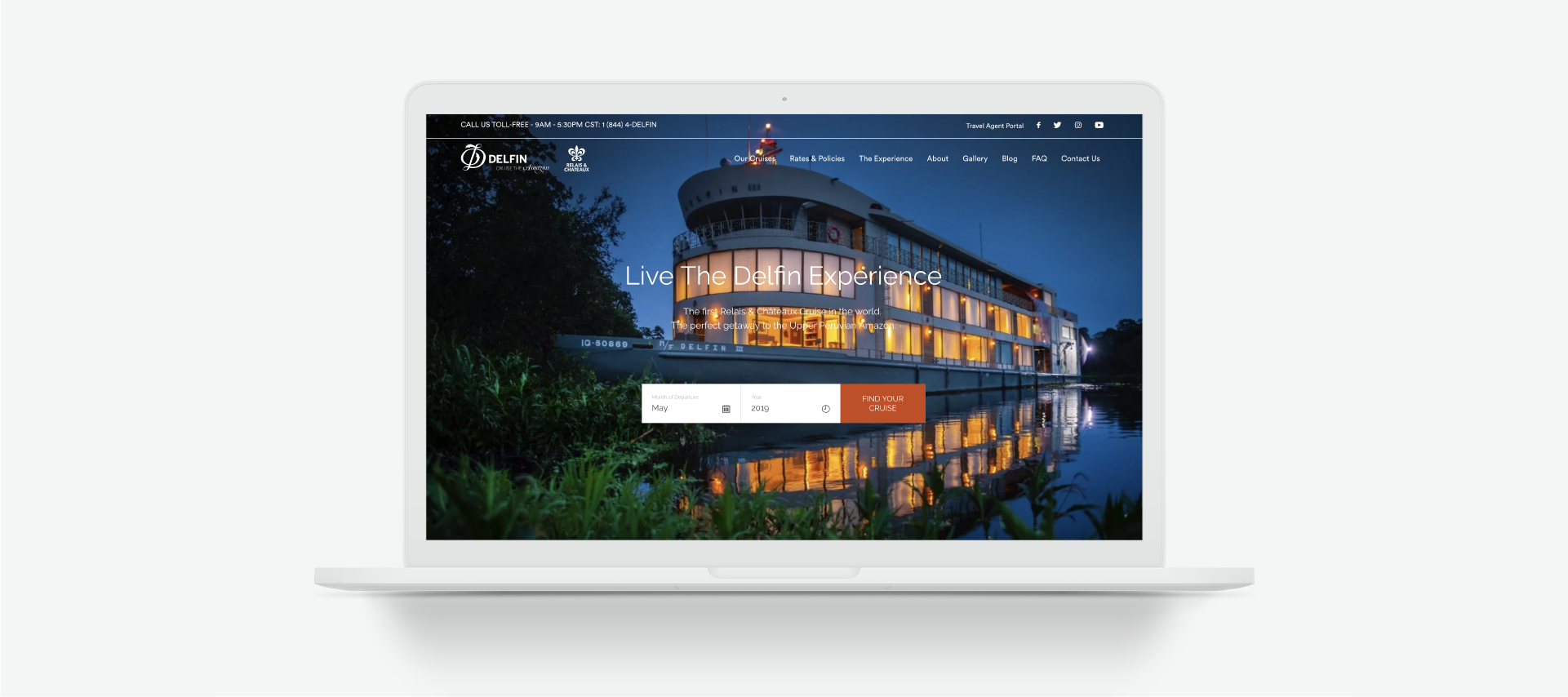
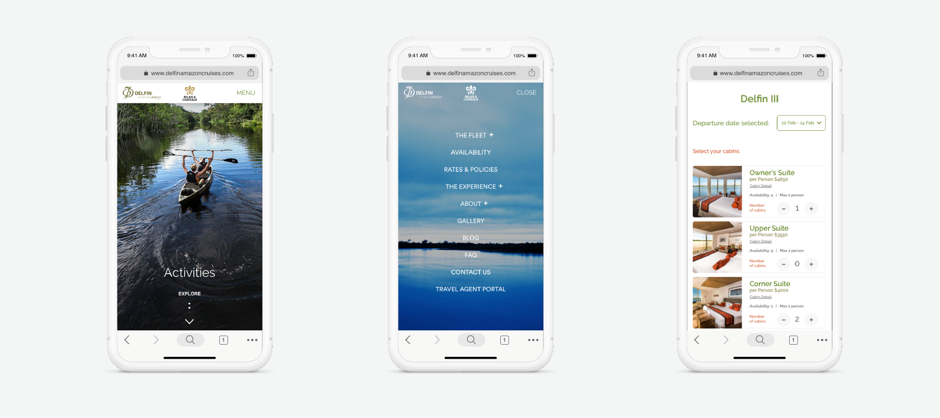
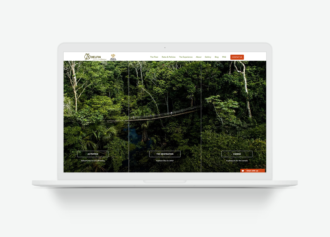
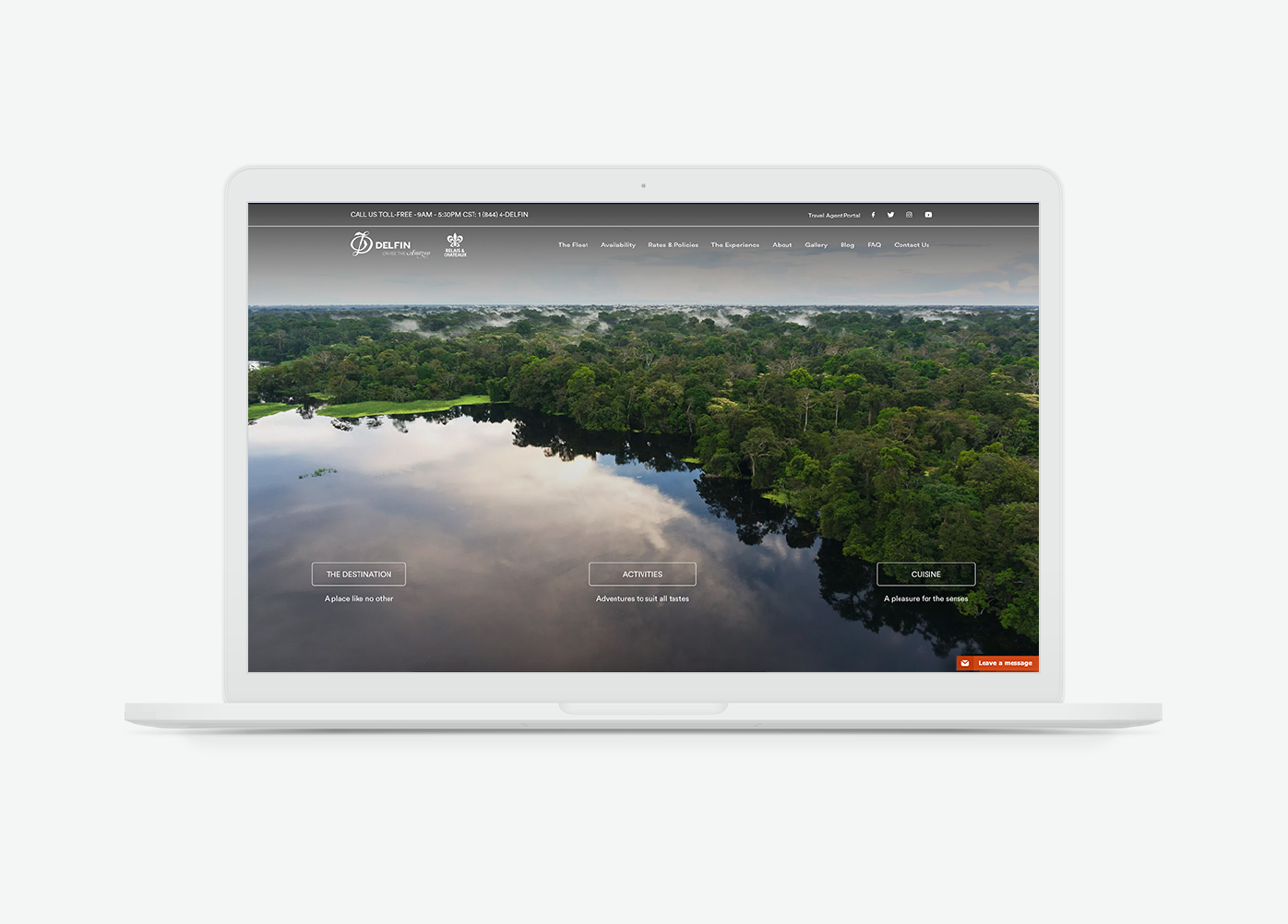
Delfin Amazon Cruises is a world class hotel that belongs to the prestigious Relais & Chateaux collection of hotels worldwide. The project consisted of research, ideation, design, and technological development of their new digital platform, with the aim of establishing a consolidated booking/sales channel.
The challenge.
Delfin Amazon Cruises’ ideal target audience are adults between 45 and 65 years old who live in Australia, Europe, and the United States. The average ticket price ranges from USD 8,000 – USD 10,000, so achieving an online reservation or sale is not an easy task. In order to accomplish the business’ digital goals, we had to understand the user’s mental model, concerns, barriers, needs, motivations and more, in order to offer high-value content throughout a digital experience that would captivate and motivate them to travel to the Amazon jungle.
About the customer journey.
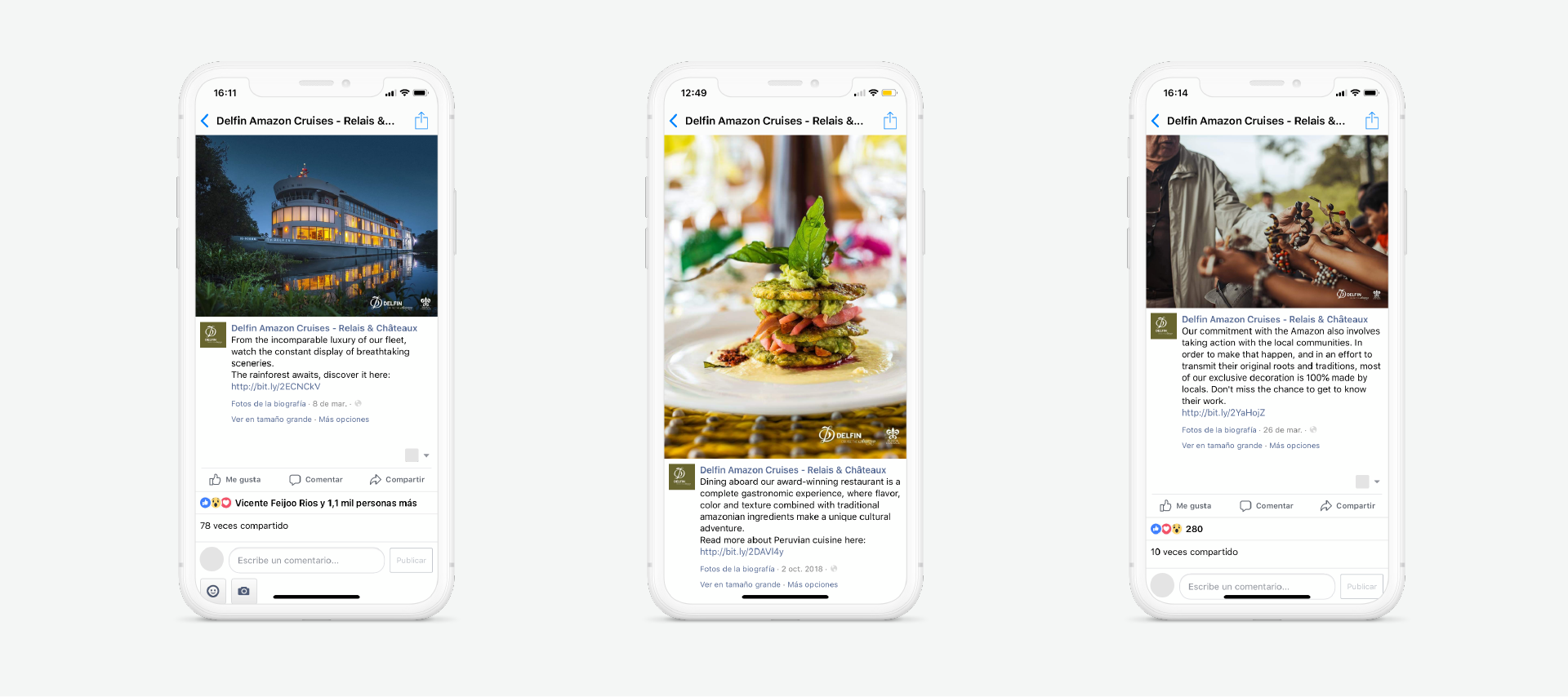
We understand that within the customer journey, content plays an extremely important role in the purchasing decision. Through a deep investigation in which we crossed qualitative and quantitative data, we defined that awareness is generated on Facebook, Instagram, and Google Ads, while conversion increases with the efforts made on these digital channels + a good SEO strategy. The type of content was decisive in capturing the attention of potential customers, so thanks to a proper analysis of the data obtained, we were able to understand which categories of content and types of ads generated traffic with a higher number of qualified leads, having a direct impact on the number of bookings generated.
UI Kit.
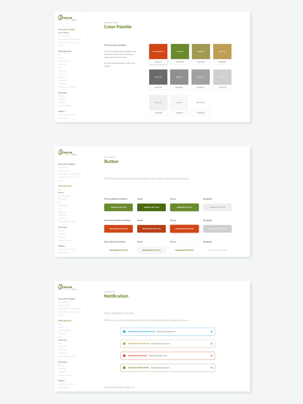
From the beginning, we knew that we needed a very well-structured and documented Design System (DS) to help us maintain product standardization and homogeneity, allowing us to scale quickly over time. We decided to start with a UI Kit that would allow us to centralize, categorize, and document all web components and elements. This allowed us to be efficient throughout the platform construction process, being strategic from the outset of the project. It included everything from color palettes, typography, button types, component behavior, grids, notifications, and more. Additionally, we decided to include templates that we designed for Facebook, IG, mailing, and Google Ads, in order to have a visual digital ecosystem that acts transversally, empowering the brand and maintaining its consistency.
